Linear — Dark Gradient SaaS
Dark SaaSPrecision-engineered dark UI with a single electric accent and hairline structure.
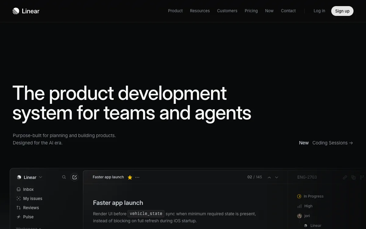
- Mood
- Engineered, calm, premium-technical. Feels like a tool built by people who care about craft.
- Colors
- Near-black base (#08090A / #0E0F11), cool neutral grays for text, a single electric-violet-to-blue accent used sparingly. Almost no pure white; brightest text is a soft #F7F8F8.
- Type
- Inter (or similar geometric grotesque), tight letter-spacing, heavy weights on the hero headline, generous line-height in body. Sizes step down cleanly; no decorative fonts.
- Layout
- Centered hero with a short punchy headline + one-line subhead + single primary CTA. Thin vertical rhythm, sections separated by faint 1px borders, feature blocks in bordered cards or a subtle grid.
- Motion
- Slow fade-up on scroll, gentle gradient drift in the background, cursor-reactive glow behind the hero. Nothing bouncy; everything eased and quiet.
- Texture
- Fine noise/grain overlay, 1px hairline borders (rgba white ~8%), soft radial glows bleeding from behind headings and cards.
- Imagery
- Generate: soft radial violet-to-blue glow orbs, a fine noise/grain overlay (PNG, low opacity), and dark app/dashboard UI mockups. Keep imagery dark, minimal, and glow-driven. Tool: kie-ai Flux or Seedream for glows/textures; GPT-Image for stylized UI panels.
- Don't
- No hard drop shadows, no bright pure-white backgrounds, no rounded-cartoon shapes, no saturated multi-color palettes.
Use in a session
linear-dark
Tell Claude: build [my thing] using swipe ref linear-dark
Full recreation prompt
Recreate a landing page in the "Linear — Dark Gradient SaaS" style (Dark SaaS). This is a VIBE / STYLE-TRANSFER task, not a clone: apply the design DNA below to MY content and section structure, do not copy the reference's copy or exact layout.

Design DNA:
- Mood: Engineered, calm, premium-technical. Feels like a tool built by people who care about craft.
- Colors: Near-black base (#08090A / #0E0F11), cool neutral grays for text, a single electric-violet-to-blue accent used sparingly. Almost no pure white; brightest text is a soft #F7F8F8.
- Typography: Inter (or similar geometric grotesque), tight letter-spacing, heavy weights on the hero headline, generous line-height in body. Sizes step down cleanly; no decorative fonts.
- Layout: Centered hero with a short punchy headline + one-line subhead + single primary CTA. Thin vertical rhythm, sections separated by faint 1px borders, feature blocks in bordered cards or a subtle grid.
- Motion: Slow fade-up on scroll, gentle gradient drift in the background, cursor-reactive glow behind the hero. Nothing bouncy; everything eased and quiet.
- Texture: Fine noise/grain overlay, 1px hairline borders (rgba white ~8%), soft radial glows bleeding from behind headings and cards.
- Avoid: No hard drop shadows, no bright pure-white backgrounds, no rounded-cartoon shapes, no saturated multi-color palettes.

Imagery (generate real assets, do not use placeholders): Generate: soft radial violet-to-blue glow orbs, a fine noise/grain overlay (PNG, low opacity), and dark app/dashboard UI mockups. Keep imagery dark, minimal, and glow-driven. Tool: kie-ai Flux or Seedream for glows/textures; GPT-Image for stylized UI panels.

Reference exemplar: https://linear.app. Build the page around the content I give you next, faithfully channeling this aesthetic, and generate the matching imagery described above.