Mono — Swiss Minimalist
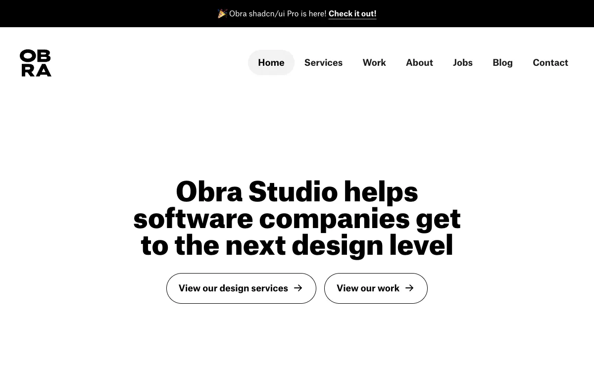
Swiss MinimalistInternational Typographic Style: strict grid, one accent, ruthless whitespace.
- Mood
- Rational, confident, quiet. Order as beauty. Nothing extra.
- Colors
- White or light-gray base, black text, exactly one bold accent (often red or blue). Monochrome discipline.
- Type
- A neo-grotesque (Helvetica/Neue Haas/Inter) set with rigor. Strong type hierarchy through size and weight only, flush-left ragged-right, tight tracking on big heads.
- Layout
- Visible modular grid, generous margins, precise alignment, asymmetric balance. Content sits on clear columns; whitespace does the work.
- Motion
- Minimal and precise: crisp fades, slide-ins along the grid axes. No decoration.
- Texture
- Completely flat. No shadows, no gradients, no ornament. Rules/lines used structurally.
- Imagery
- Sparse, deliberate imagery: one bold duotone or high-contrast geometric photograph, strong typographic compositions. Tool: kie-ai Flux with a duotone treatment; Pexels for a strong photo to duotone.
- Don't
- No gradients, no illustration clutter, no decorative fonts, no centered mush. Respect the grid.
Use in a session
mono-swiss
Tell Claude: build [my thing] using swipe ref mono-swiss
Full recreation prompt
Recreate a landing page in the "Mono — Swiss Minimalist" style (Swiss Minimalist). This is a VIBE / STYLE-TRANSFER task, not a clone: apply the design DNA below to MY content and section structure, do not copy the reference's copy or exact layout.

Design DNA:
- Mood: Rational, confident, quiet. Order as beauty. Nothing extra.
- Colors: White or light-gray base, black text, exactly one bold accent (often red or blue). Monochrome discipline.
- Typography: A neo-grotesque (Helvetica/Neue Haas/Inter) set with rigor. Strong type hierarchy through size and weight only, flush-left ragged-right, tight tracking on big heads.
- Layout: Visible modular grid, generous margins, precise alignment, asymmetric balance. Content sits on clear columns; whitespace does the work.
- Motion: Minimal and precise: crisp fades, slide-ins along the grid axes. No decoration.
- Texture: Completely flat. No shadows, no gradients, no ornament. Rules/lines used structurally.
- Avoid: No gradients, no illustration clutter, no decorative fonts, no centered mush. Respect the grid.

Imagery (generate real assets, do not use placeholders): Sparse, deliberate imagery: one bold duotone or high-contrast geometric photograph, strong typographic compositions. Tool: kie-ai Flux with a duotone treatment; Pexels for a strong photo to duotone.

Reference exemplar: https://mono.company. Build the page around the content I give you next, faithfully channeling this aesthetic, and generate the matching imagery described above.