Oatly — Warm Playful DTC
Warm Playful DTCScrappy, hand-drawn, self-aware consumer brand that talks like a witty friend.
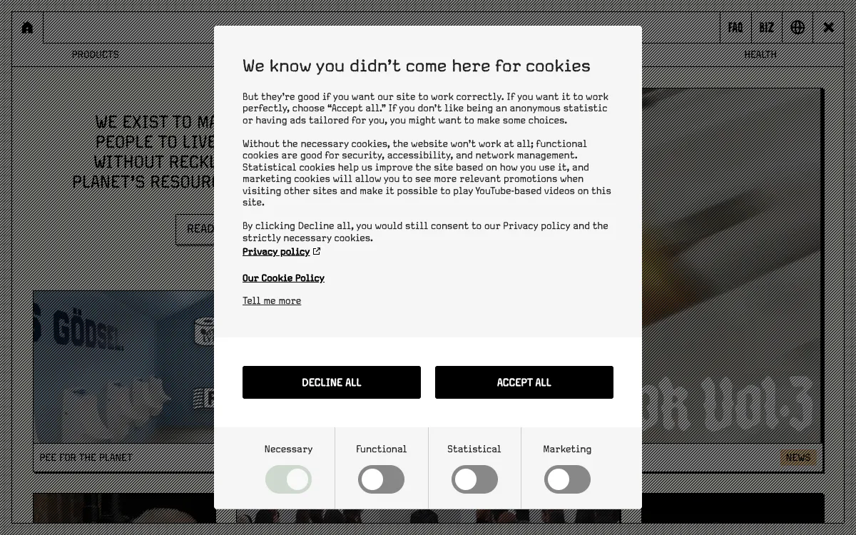
- Mood
- Irreverent, warm, human, a little chaotic on purpose. Anti-corporate, conversational, funny.
- Colors
- Cream/off-white base, black ink, one or two bold flat accents (Oatly blue, warm red). Slightly off-register, zine-like color.
- Type
- Chunky condensed sans or hand-lettered display for headlines, mixed with a plain typewriter/sans body. Intentionally imperfect, mixed sizes, handwritten scrawls.
- Layout
- Collage/zine energy. Off-grid placements, hand-drawn doodles and arrows, stickers, packaging cutouts. Copy is the hero — long, funny, first-person.
- Motion
- Playful wiggle/scribble reveals, sticker pop-ins, jittery hover states. Fun over polish.
- Texture
- Hand-drawn linework, marker doodles, halftone, paper cutout collage, visible imperfection.
- Imagery
- Generate: hand-drawn doodles, marker scribbles, halftone cutout collage elements, and sticker badges as transparent PNGs. Intentionally imperfect. Tool: kie-ai Flux or nanobanana for illustration; kie-ai Recraft remove-bg for cutouts.
- Don't
- No slick gradients, no corporate stock photography, no rigid symmetry, no formal tone.
Use in a session
oatly-playful-dtc
Tell Claude: build [my thing] using swipe ref oatly-playful-dtc
Full recreation prompt
Recreate a landing page in the "Oatly — Warm Playful DTC" style (Warm Playful DTC). This is a VIBE / STYLE-TRANSFER task, not a clone: apply the design DNA below to MY content and section structure, do not copy the reference's copy or exact layout.

Design DNA:
- Mood: Irreverent, warm, human, a little chaotic on purpose. Anti-corporate, conversational, funny.
- Colors: Cream/off-white base, black ink, one or two bold flat accents (Oatly blue, warm red). Slightly off-register, zine-like color.
- Typography: Chunky condensed sans or hand-lettered display for headlines, mixed with a plain typewriter/sans body. Intentionally imperfect, mixed sizes, handwritten scrawls.
- Layout: Collage/zine energy. Off-grid placements, hand-drawn doodles and arrows, stickers, packaging cutouts. Copy is the hero — long, funny, first-person.
- Motion: Playful wiggle/scribble reveals, sticker pop-ins, jittery hover states. Fun over polish.
- Texture: Hand-drawn linework, marker doodles, halftone, paper cutout collage, visible imperfection.
- Avoid: No slick gradients, no corporate stock photography, no rigid symmetry, no formal tone.

Imagery (generate real assets, do not use placeholders): Generate: hand-drawn doodles, marker scribbles, halftone cutout collage elements, and sticker badges as transparent PNGs. Intentionally imperfect. Tool: kie-ai Flux or nanobanana for illustration; kie-ai Recraft remove-bg for cutouts.

Reference exemplar: https://www.oatly.com. Build the page around the content I give you next, faithfully channeling this aesthetic, and generate the matching imagery described above.